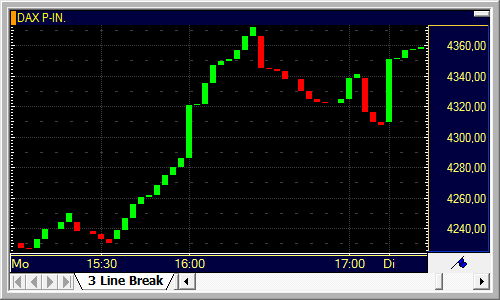
Three Line Break charts are similar to Point and Figure charts. Like them, they are plotted independent of time, which is why the time scale on these types of charts is not shown in a linear way. The prices of a symbol are displayed as rising and falling columns, the so-called lines.
New lines into the same direction are added only if the Close price of the chosen period (for example, the closing price of the day for daily charts) exceeds the previous high for rising lines, or drops below the previous low for falling lines. If no new highs or lows are reached, nothing is drawn on the chart for that day (or other chosen period – see also Changing the Data Compression).
A reversal into the opposite direction (for example, a new falling line if the previous line was rising) can only take place when the price for that period exceeds the highs of the three previous lines (reversal from falling to rising lines) or drops below the lows of the three previous lines (reversal from rising to falling lines). This is the reason why this type of chart is called "Three Line Break".
In comparison with Point and Figure charts, the Three Line Break chart has the advantage that there is no fixed reversal amount. Rather, the reversal limit is taken from the past price development dynamically. Like in Point and Figure charts, new trends reveal themselves late, but the signals generated by a Three Line Break chart can be more significant than the ones given by a classic bar chart, for example.
Three Line Break charts were originally developed and used in Japan. To find more detailed information about them, see for example Steve Nison: Beyond Candlesticks. John Wiley & Sons, 1995.
Tip We recommend to change the chart properties setting under General > Time Region to a fixed period when using Three Line Break charts. If you use a dynamic time region, for example a fixed number of records, the Three Line Break chart will be recalculated every time a new record is added and the oldest record is taken out of the chart. Therefore, the display of historical data in the chart could vary over time, as it also depends on the initial data in the chart. Use the option Period (from-to) to avoid this.